Friday 20 March 2015

Book Covers Final Piece

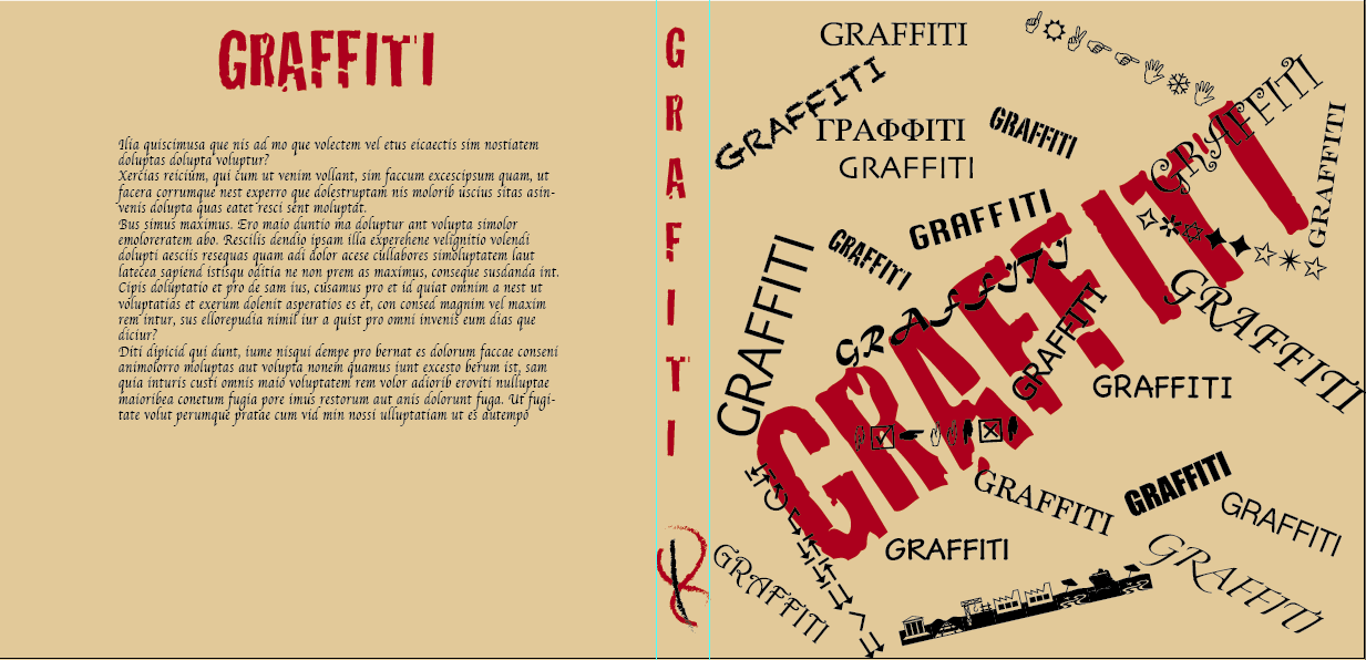
Within this assignment I was able to create four different book covers and the topic for each one was either graffiti, street art, outsider art and murals. Before creating the designs I researched various book cover designs each which from different years.
These designs help me with my designs and I was able to use them without making a complete replica of it. For example 'Gang Girls' written by Maisie Mosco, I created a design from her book, however changed a few pieces which would make it my own.
In my design you can see there are similarities between Maisie Mosco and my piece however the difference between it is that the font I used was different, I used 'Tekton Pro' and I believe in Maisie Mosco's font she used 'Chalkboard'.

After creating this design I started my other covers and I also took in some ideas from other people's books. For example I created a design based on a book about photography by Ed Collacot.


My next design was all created out of imagination however the images i added to the design were all from a secondary source. In this cover I acquired an image which was to small however i was able to make it still look sharp and clear. I did this by opening the image in Adobe Illustrator and whilst highlighting the image I went from 'Object' to 'Image Trace' to 'Make'. After this I choose window and opened the Image trace panel and this allowed me to edit the image. The design for the background is where I used image trace.

This next design was also based from another design. I stuck with the layout but only change the font of the text.


Friday 6 March 2015

Book Cover_

Lesson 1

In todays lesson I created a couple of book cover designs which were inspired by other artists and I also created one of my own unique designs.


This Design was inspired by bauhaus. The similarities is that the backgrounds are both black and the text is filled in with primary colours also pop art  related colours. However with my design instead of using the font as the original I use four different fonts, just to give it a bit of variety.


Lesson 2

In this lesson we learnt about the placeholder text tool and I used it in my book cover design. My task was to create four different blurb in different ways. For example, one blurb would be all bold or another would be placed at the top or the bottom. To create a placeholder text I needed to go onto InDesign and create a text box at a reasonable size. When creating the text box I highlighted the box and clicked on type which is on the main menu, after clicking on type, as I highlighted the text box I was able to click on 'placeholder text'. This allowed me to add a paragraph of text, however it wasn't words that are real but letters scrambled every where. The point of this task was to just create four example of different styles/types of blurbs.

My example's:


Friday 30 January 2015

Book Covers 1900's

In this lesson I looked at a page with the four designs. The class needed to figure out what the difference with each of them was. For example, image 3 was different to the rest as it wasn't advertising an event like the others, it was giving a message. Another example was that image 2 had a different alignment than the others, it was ranged to the left and the others were ranged in the middle. After this task I was told to make a page with several images of book covers between the 1940's - 1990's. I saw that the covers from different years had different styles. For example, in the 1940's the drawings/covers was dull and plain. Most of the covers had white backgrounds.
After the research task I had to create a book cover design of my own. However I didn't create an image of my own but from a secondary source. I found an image in grayscale of a man playing the trumpet. The design of the cover is supposed to be in comparison to a cover in the 1940's so that's why I chose to create my background blank and in have a simple sized font that wrote the title of the book (Street Art).

Friday 23 January 2015

Book Cover

In This lesson I began the assignment and started with the first task which was to create a research page about street art, graffiti, murals and outsider art. I created a mood board with images of art and then stuck it in my book.
After creating the mood board I decided to create a design for my book cover. I chose to start of with the topic street art. Dozens of ideas were popping up in my head and finally I thought of one which was suitable for the topic.

Friday 9 January 2015

Flash Tutorial


In this part of the lesson I had to create an animation of a moving object. Firstly, I had to create a shape so I chose a skateboard. After creating the shape I needed to create it as a Symbol. By doing this I had to go on modify on the task bar above and then click on convert to symbol. I was then able to start moving it around and creating an animation. So when creating it I had to first insert a keyframe on the 12th frame by right clicking it and selecting insert key frame. After creating a key frame I placed the image on the other side of the page.  Then I created another frame on the next 12th frame and place the image on the original area. After creating the whole clip I highlighted the timeline selected classic tween on the insert bar on the task bar above. This created a smooth and well running animation clip of a skateboard moving back and forward.

Typograpghy


In this lesson I learnt different term of typography, info-graphics. I first had to type in 'Blowfish Angels' in a 'Times New Roman' font and increase the size which it cover most of the page. After this I selected both words and expanded it (Object > Expand). The next step was to colour in specific areas of the letters. I had to first select a single letter by using the group selection tool, and then use the knife tool and cut a section off of a letter and fill it in with a colour of my choice. I then ad to do this for all the other letters.

Friday 14 November 2014

Graffiti

Today I played around in photoshop and created an image of a piece of graffiti art with my name as the design. I first needed to get an image of a wall from the teachers folder and then I had draw out my name. I used a default paintbrush and the size was 20. After drawing out my name (in black) I double clicked on the layer I drew on the layers window, another window popped up called layers style. I was able to fiddle about with different effects and came up with this.

After finishing off this task, I was told to recreate the same design as much as i can but with different lettering/ different word. I was able to remember the colour and what brush tool I used, however I forgot the size of the brush which made a big difference in the design in my opinion.