Friday, 14 November 2014

Graffiti

Today I played around in photoshop and created an image of a piece of graffiti art with my name as the design. I first needed to get an image of a wall from the teachers folder and then I had draw out my name. I used a default paintbrush and the size was 20. After drawing out my name (in black) I double clicked on the layer I drew on the layers window, another window popped up called layers style. I was able to fiddle about with different effects and came up with this.

After finishing off this task, I was told to recreate the same design as much as i can but with different lettering/ different word. I was able to remember the colour and what brush tool I used, however I forgot the size of the brush which made a big difference in the design in my opinion.

Friday, 7 November 2014

Width Tool Test


I first set up a A3 file (landscape format). On the page, I drew my name using the pencil tool and it needed to also be written big so i could use a the next tool later. After this drawing step I used the width tool. This tool would allow me to expand the lines I have drawn. I was was able to squash and squeeze the lines to create interesting shapes.

To create this more slightly complex example I needed to go through a few steps. I first needed to expand the letter, from there it created a lot of anchor points on the letter, so then I needed to simplify it by going onto object -> path -> simplify. After this step I needed to create a gradient mesh which would allow me to add multiple colours onto each individual letter. I went through different colours and shapes and below is where you can view them.

Alternative colours
Bob's Fish and Chips Logo Design

In this task I created a logo out of scratch by using the brush tool. I had thought of various ideas on how the logo would look like and eventually I thought of the idea and started sketching. However my final piece wasn't good enough for my classmates and i had to tweak it up a bit but in the end I only changed the lettering as I thought the design of the fish was great. In the end the lettering in the logo ended up in a normal handwriting style because I thought it fitted the design of the fish as it was also a simple piece of drawing. After created the logo i experimented with colours and sadly ended up with nothing good, so I left it blank and thought I would complete it later.


Friday, 17 October 2014

Today I learnt how to make an abstract piece in photoshop using different tools and colours. I was painting on an A4 (white) page.
After i made these designs I used one of them as a design for a box. Here is the final piece.
In todays lesson i have demonstrated several formal elements (line, colour, texture, pattern, and tone) 

Friday, 3 October 2014


Today I learnt how to change the resolution depending on how i want my image to come out like. I found out that the more higher the number in the resolution, the better it will come out. For the task i was set to do, I chose to make the resolution 150 pixels/inch as I didn't need it high and also 300 pixels/inch would of made my task a little bit harder as it would of made it slow.


I also learnt how to morph an object by using the 'mesh distort' tool (object -> Envelope distort -> mesh distort). With this tool I was able to change the features of the dog with the way I like it. To morph an image I first needed to get an image from the internet.  

After choosing an image which I liked, I needed to open it in Adobe Photoshop and delete the background and the body. This is because I only wanted images of animal heads. When I only had a head, I saved the image once again and opened it in Adobe Illustrator.After opening the image I started morphing the face. (object -> Envelope distort -> mesh distort) A box will show up looking like this.


I was able to change the grid on the image, however I left both the row and column section as 4.


After adjusting the face of the dog my final piece came out like this.
Other examples:
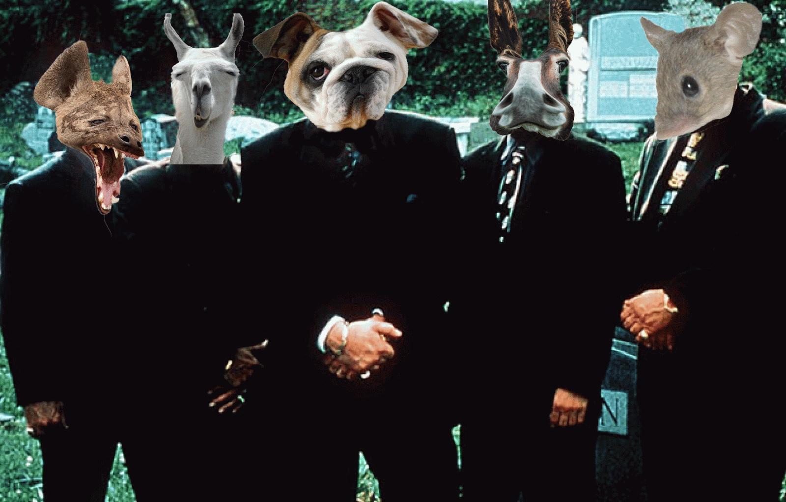
After distorting a lot of faces of different animals, I added the heads on an image of mafia men which I also took the heads off. 

When creating this image I used the 'clone stamp tool' to fill the in the transparent areas. 


Friday, 26 September 2014

This is an example of using layer masks and making a surreal image.


I used this image of a lion to test out how to use a layer mask. After making a new layer mask I added a gradient to it. To make an effect like this:

Friday, 19 September 2014

Firstly, I created a square and then used the effect bar, and clicked on extrude and bevel. I increased the extrude depth and it created the shape in the image above. I used the colour brown to make it seem more like a box and I also added a bar code to make it even more realistic. 
Pop Art Inspired Lettering